

Sinead Leydon
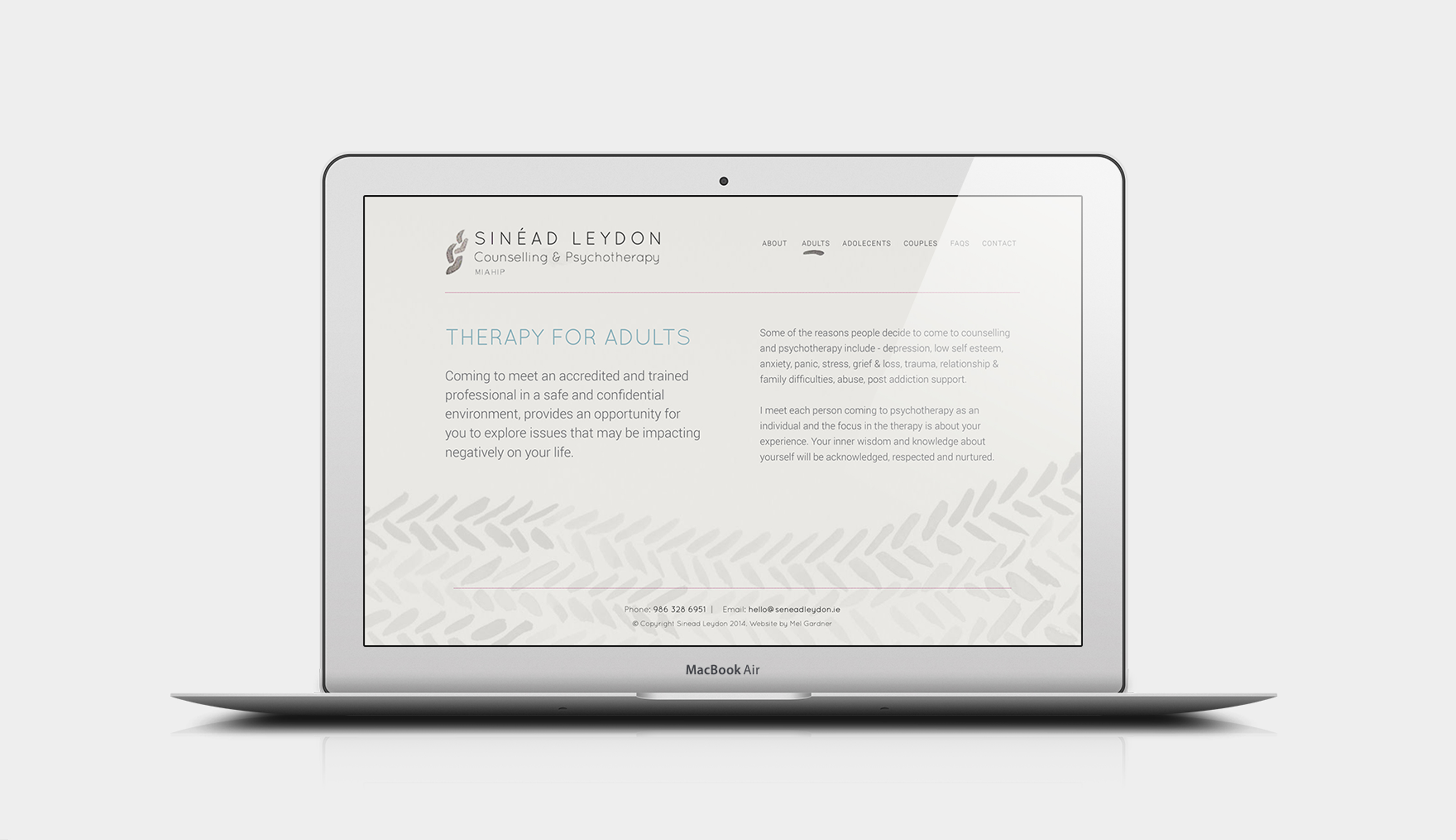
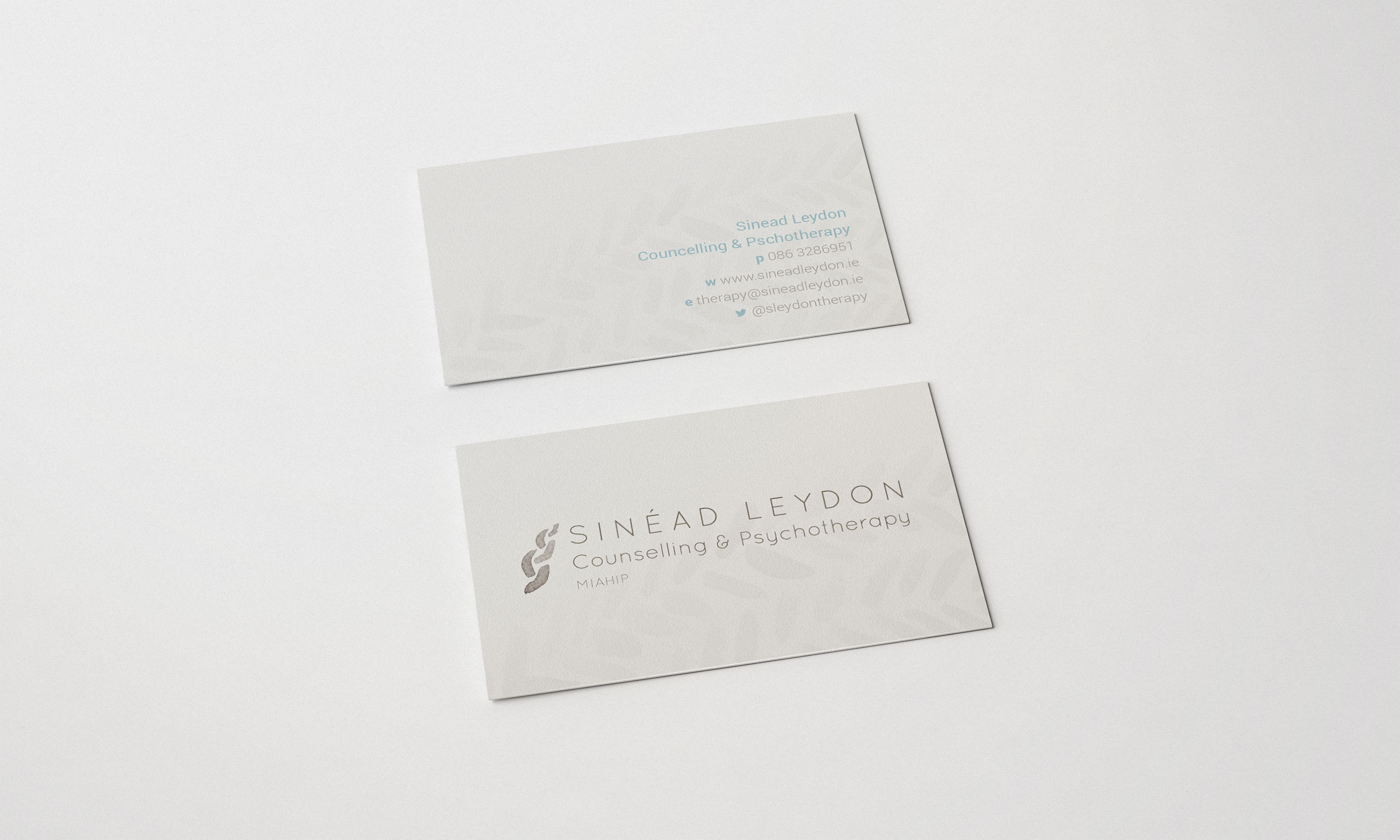
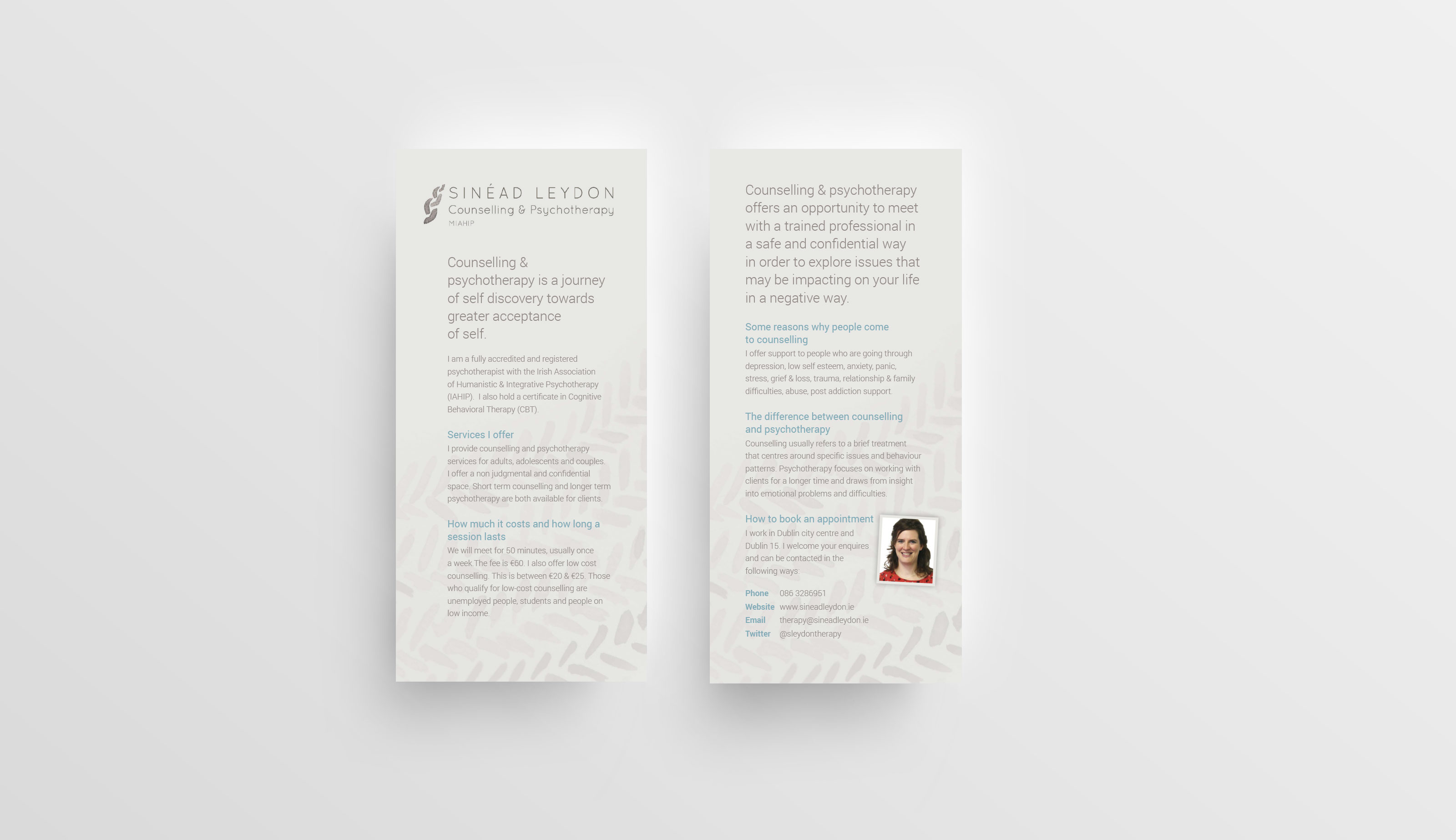
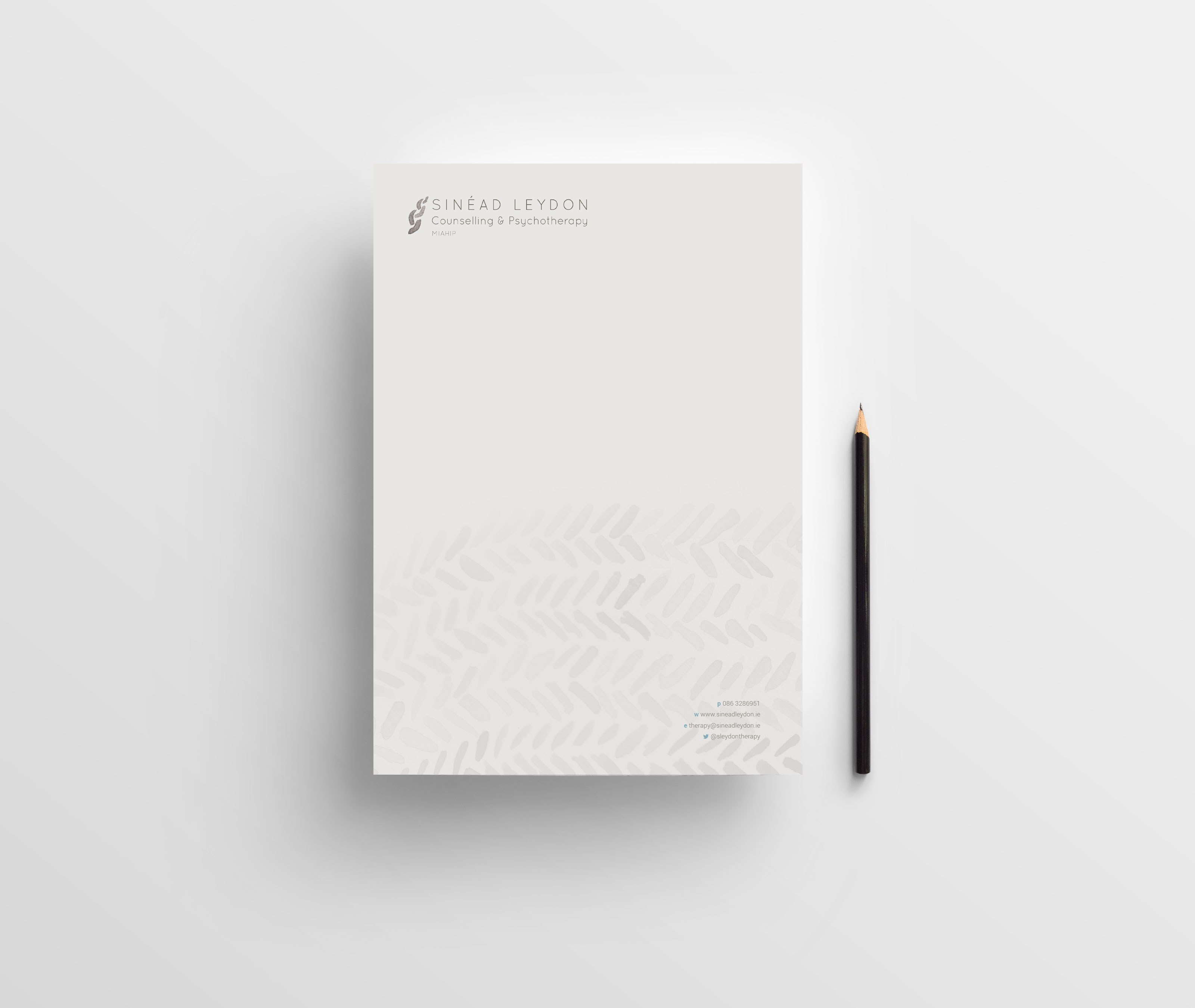
Sinead Leydon approached me to work with her on branding her therapy practise. She wanted something was unique, humanistic and was photograph free. Sinead really liked the idea of weaving imagery as she felt it illustrated integration; which is what therapy is about. She also soft natural muted colours. The weaving imagery was illustrated using watery ink on thick watercolour paper, the beautiful tonal variation of the watercolours gave it movement and depth. This provided a motif that was used across the brand. When combined soft colours – a beige, pink and blue, it gave a very calming and human feel.
Date
November 27, 2015
Client
Sinead Leydon
Project Type
Website, Identity, Marketing Materials